- Yes there is Typography in video...USE IT WELL!
Rule for the class - Don't just use the default font.
- Nothing brings down the quality of your video more than bad typography
- Use an appropriate font:

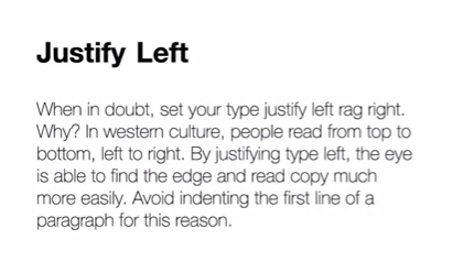
This font looks more like closed captioning than the actual title - Justify Left
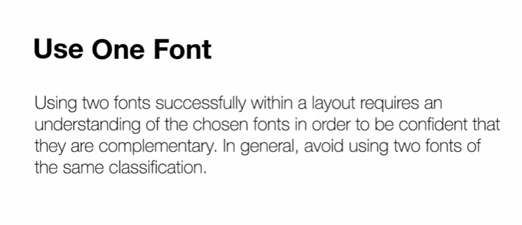
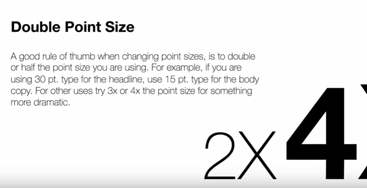
Especially in video because people have limited time to read - One font only please...unless you work working with Typographic contrast
Again, remember people have to read fast - Don't make your contrast subtle
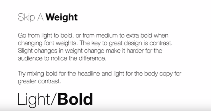
- Again...Don't make your contrast too subtle
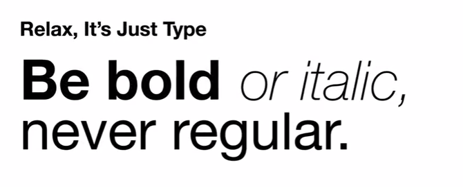
- Diagonal type is lame
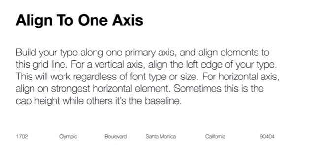
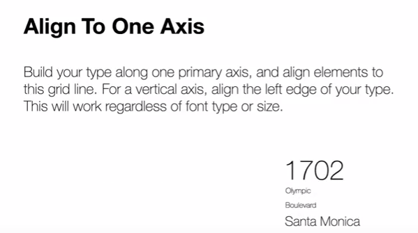
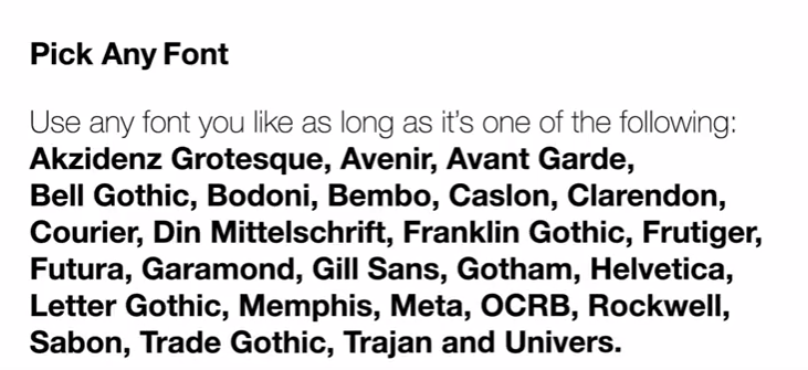
- Keep to the classics - They are the most reliable
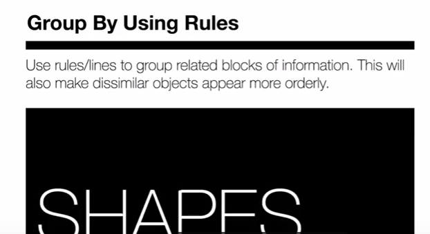
Unless you are really solid with typography. - Use rules and text boxes - it can solve many problems
Again...readability - If you're going to break the rules...

Break them!
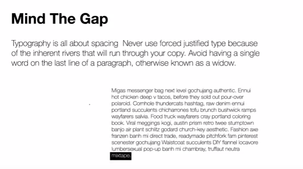
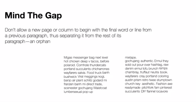
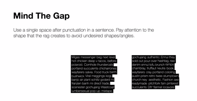
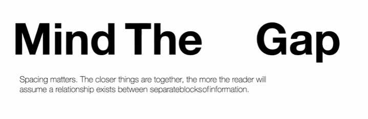
- Spacing