Here is a possibility.


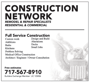
- Definite focus
- Easier to read each section
- Looks more professional
- Not all caps - good thing
- Border doesn't outcompete
- No reasons for the stars or multiple logos (not a good one anyway so make the best of it)
- Is there repetition and does it work?
- How about alignment?