- <img src="url" attributes>
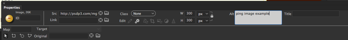
- Image-specific attributes: width and Height, src, Link, Alt (for accessibility), Title, class, Id
- Width and Height
- Fixed pixel ratio ex: W 500px H 200px
- Pecentage ex: W 90% H auto (see the image above) - recommeded for Responsive design
- Inserting images:
Insert>image: <img src="images/ivy.jpg>Images in line with text:
 TEST TEXT align="middle"
 - How do you wrap text?
- Answer: image style float
- .left { float:left }
This is a lot of text... This is a lot of text... This is a lot of text... This is a lot of text... This is a lot of text... This is a lot of text... This is a lot of text... This is a lot of text... This is a lot of text... This is a lot of text... This is a lot of text... This is a lot of text... This is a lot of text... This is a lot of text... This is a lot of text... This is a lot of text... This is a lot of text... This is a lot of text... This is a lot of text... This is a lot of text... This is a lot of text... This is a lot of text... This is a lot of text... This is a lot of text... This is a lot of text... This is a lot of text... This is a lot of text... This is a lot of text... This is a lot of text... - Add a <br clear="all"> to stop the word wrap. See below.
- How do you wrap text?
- Image-specific attributes: width and Height, src, Link, Alt (for accessibility), Title, class, Id
<!doctype html>
<html>
<head>
<meta charset="UTF-8">
<title>Image example</title>
<style type="text/css">
.alignleft {float: left; padding-right: 10px}
</style>
</head>
<body>
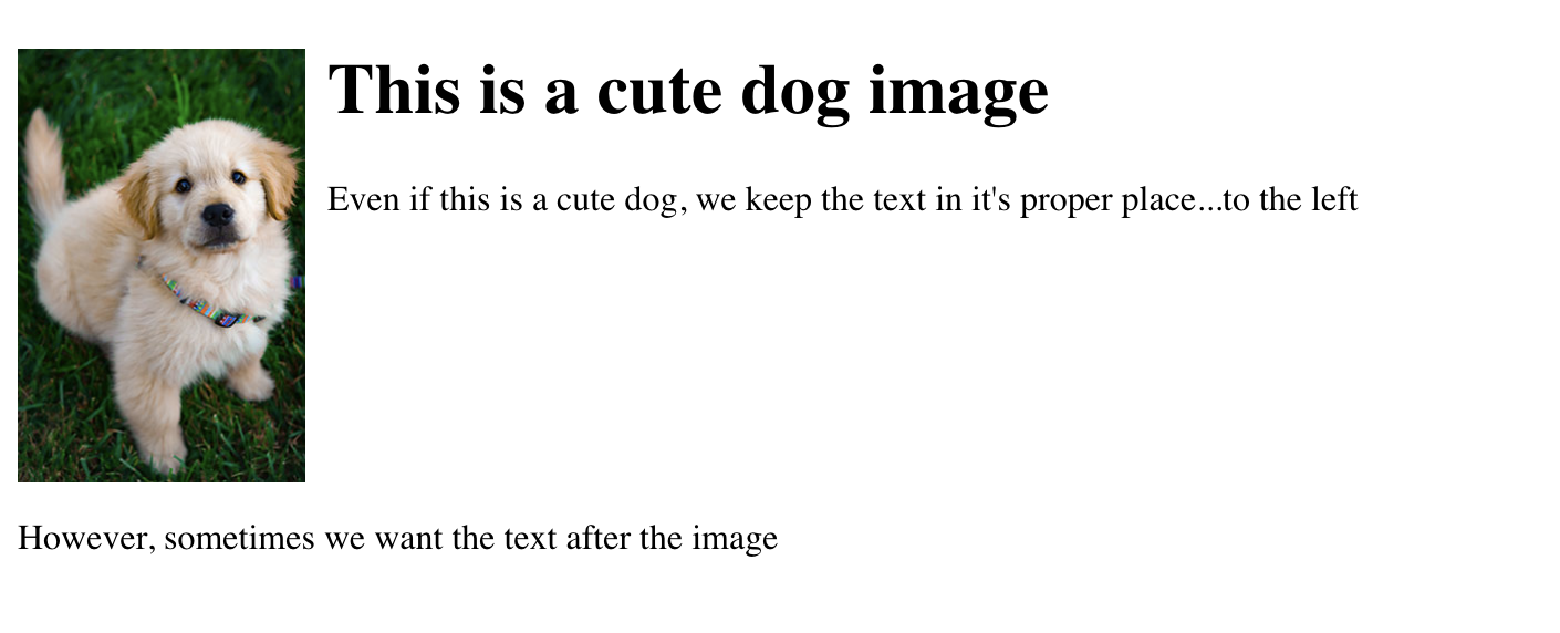
<img src="images/Dog.jpg" alt="Dog example image" width="10%" height="auto" class="alignleft">
<h1>This is a cute dog image</h1>
<p>Even if this is a cute dog, we keep the text in it's proper place...to the left</p>
<br clear="all">
<p>However, sometimes we want the text after the image</p>
</body>
</html>