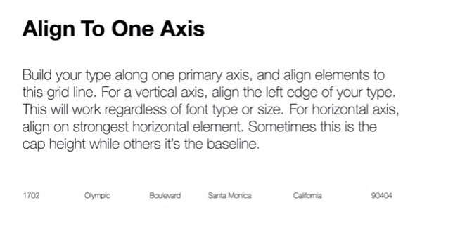
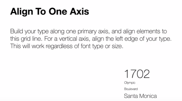
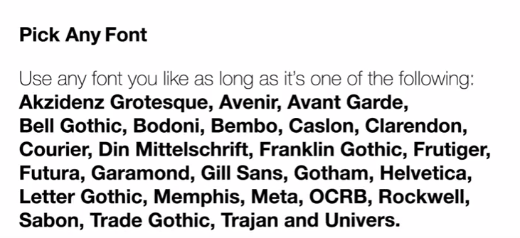
- Yes there is Typography in web...USE IT WELL! Rule for the class - Don't just use the default font.
- Nothing brings down the quality of your website more than bad typography
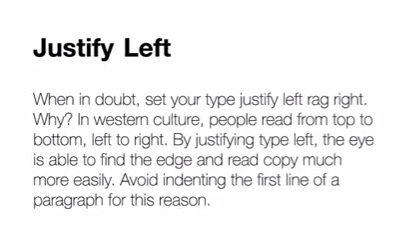
- Justify Left

Especially in video because people have limited time to read
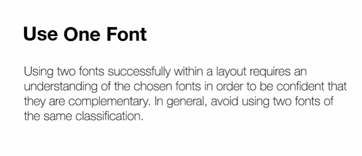
- One font only please...unless you work working with Typographic contrast

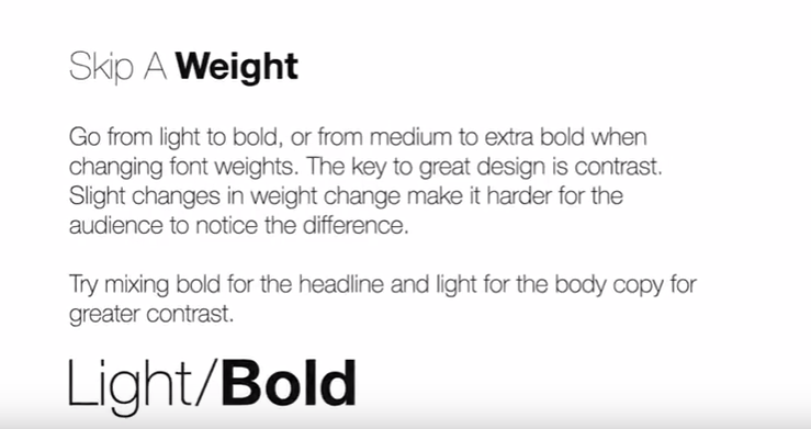
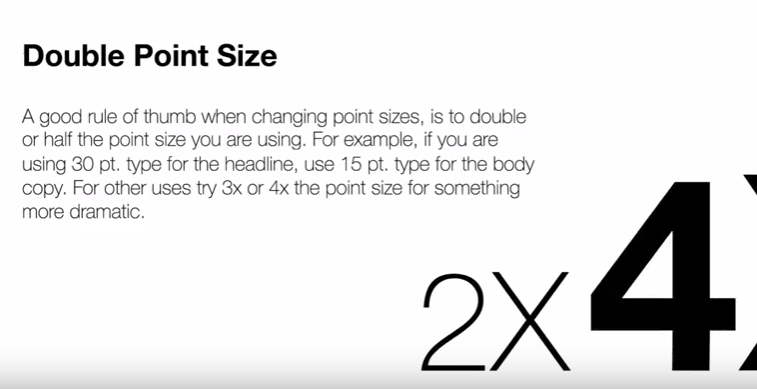
- Don't make your contrast subtle

- Again...Don't make your contrast too subtle

- Diagonal type is lame


- Keep to the classics - They are the most reliable

Make sure they are web safe...so:
Georgia, serif
"Palatino Linotype", "Book Antiqua", Palatino, serif
"Times New Roman", Times, serif
Arial, Helvetica, sans-serif
"Arial Black", Gadget, sans-serif
"Comic Sans MS", cursive, sans-serif
Impact, Charcoal, sans-serif
"Lucida Sans Unicode", "Lucida Grande", sans-serif
Tahoma, Geneva, sans-serif
"Trebuchet MS", Helvetica, sans-serif
Verdana, Geneva, sans-serif
"Courier New", Courier, monospace
"Lucida Console", Monaco, monospace
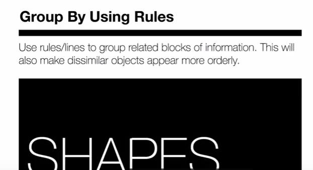
- Use rules and text boxes - it can solve many problems

Again...readability
- If you're going to break the rules...

Break them!

- Spacing
