 Now import text from a word document
- Download this text
- Import it into the Illustrator file by going to File>Place and choose the .rtf file (Keep all options to default) and click ok
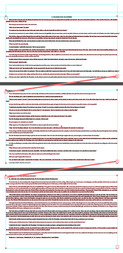
- Click and drag the cursor to fill the area inside the custom guide below the second horizontal guide
- The text overflows, but you can click the small red square on the bottom right corner of the text box and then click and drag on the second page to fill the full custom guide area to extend the text
- Repeat for the third page
- The text will still run off, but you can select all the text Cmd/Ctl A and set the size to 11pt and leading to 14 pts
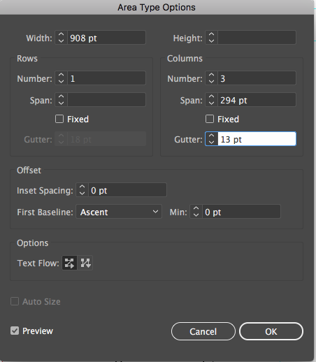
- We want to convert this to a 3-column layout. Select all type on all three boards and go to Type>Area Type Options and choose 3 columns and a gutter (space between columns) of 13. Click Preview to see the effect
- Let's clean up some of this text
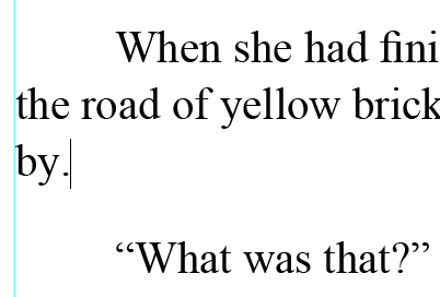
- There are some subtle problems with this text
- Straight Quotes
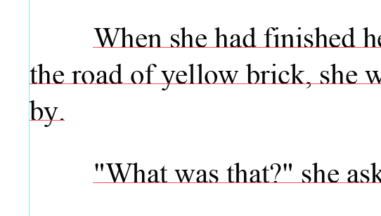
- Some kerning issues - example: the "fi" in the image below that doesn't quite connect to form a proper ligature
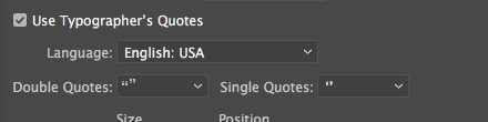
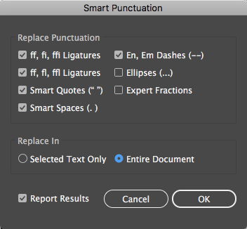
- Smart quotes is turned on by default File>Document setup>Type>Use Typographer's Quotes (checked). If you retype any quote they will become Printer's quotes
- To fix the problems to to Type>Smart Punctuation and select Whole document
- Editing point type
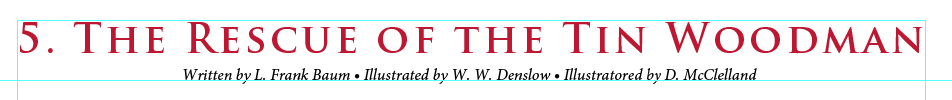
- (you can select an entire paragraph by triple clicking...double click to select a word) Select the entire first line "5. The Rescue..." by triple clicking in the line and cut/paste on top of the page. Repeat with the last lines in the document starting with "Written by L Frank Baum..."
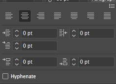
- Select both lines now pasted at the top of the first page and open the Paragraph panel from the control panel (paragraph align center - sets the center point of the line, 0 indent - removes all indents, 0 space before and after paragraph
 Then align center to the artboard
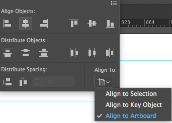

- With the titles still selected, change both to 16pt size
- Open up the character panel from the control panel and add these values to the top line: Trajan Pro Bold
- Select the second line and drag it down to snap to top of the second guide line and choose Minion Pro Italic
 Triple click the top line and to select the line and change it to 40pts. Convert to area type (Double click on the dot at the far end of the bounding box. If you don't see it try Cmd/Ctl Shift B ) Extend both sides of the bounding box to the vertical guides. Go to Type>Fit Headline...it only works if the blinking insertion marker is in the text
- With the top line still selected choose a red color from the swatches panel
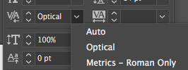
- Select the second line and open the character panel to give it proper kerning. Choose Optical for best results *For more on Optical, Metric and Auto Kerning read this blog
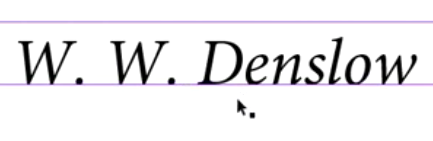
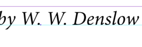
- Then increase the tracking to 40 in the character panel
- You will probably need to re-align the second line
*For the video companion go to Lynda.com