- There are basically two color modes:
- RGB - Screen additive (primary)
- CMYK - Print subtractive (secondary)
 Two schools of thought of Primary colors:
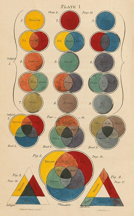
- RYB Red/Yellow/ Blue as primary and Green/Orange/Violet as secondary
- Traditional art and design theory approach - perception vs light spectrums
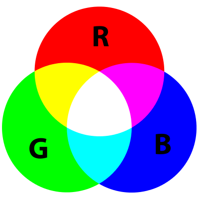
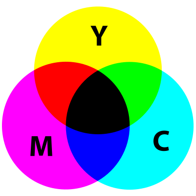 RGB Red/Green/Blue as primary and Cyan/Magenta/Yellow as secondary
- Behavior of light mixtures
- RYB Red/Yellow/ Blue as primary and Green/Orange/Violet as secondary
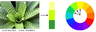
- There is also the HSB model
- Hue - core color measured in degrees
- Saturation - intensity of color (vivid = 100%, gray or white = 0%)
- Brightness - goes from white 100% to black 0%
- Color Harmony
- Pleasing to the eye. It engages the viewer and it creates an inner sense of order, a balance in the visual experience. When something is not harmonious, it's either boring or chaotic.
- Formulas:
 Analgous colors
- Three colors which are side by side on a 12-part color wheel, such as yellow-green, yellow, and yellow-orange. Usually one of the three colors predominates.
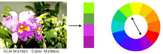 Complementary colors
- Colors are any two colors which are directly opposite each other, such as red and green and red-purple and yellow-green. These opposing colors create maximum contrast and maximum stability.
 Natural Colors
- Nature provides a perfect departure point for color harmony. Red yellow and green create a harmonious design, regardless of whether this combination fits into a technical formula for color harmony.
- Color Context
 How color behaves in relation to other colors and shapes is a complex area of color theory. Compare the contrast effects of different color backgrounds for the same red square. Red appears more brilliant against a black background and somewhat duller against the white background. In contrast with orange, the red appears lifeless; in contrast with blue-green, it exhibits brilliance. Notice that the red square appears larger on black than on other background colors.

- Psychology of color in marketing
-
As research shows, it’s likely because personal preference, experiences, upbringing, cultural differences, and context often muddy the effect individual colors have on us. So the idea that colors such as yellow or purple are able to evoke some sort of hyper-specific emotion is about as accurate as your standard palm reading.
But there’s still plenty to learn and consider if we humbly accept that concrete answers aren’t a guarantee. The key is to look for practical ways to make decisions about color.
Branding
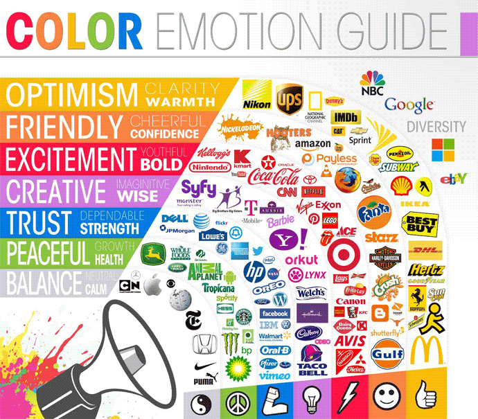
There are broader messaging patterns to be found in color perceptions. - The relationship between brands and color hinges on the perceived appropriateness of the color
- When it comes to picking the “right” color, predicting consumer reaction to color appropriateness is far more important than the individual color itself. If Harley owners buy the product in order to feel rugged, colors that work best will play to that emotion.
- Five core dimensions that play a role in a brand’s personality:
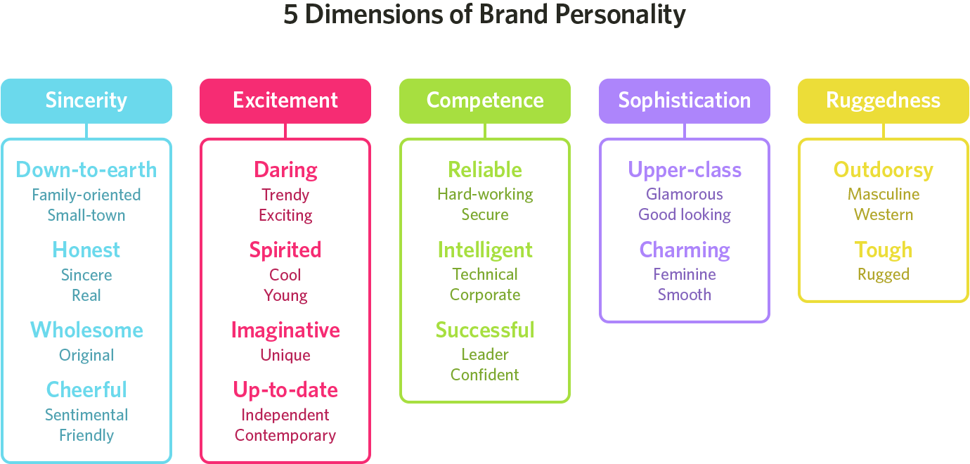
- Brands can sometimes cross between two traits, but they are mostly dominated by one. While certain colors do broadly align with specific traits (e.g., brown with ruggedness, purple with sophistication, and red with excitement), nearly every academic study on colors and branding will tell you that it’s far more important for colors to support the personality you want to portray instead of trying to align with stereotypical color associations.
- There are no clear-cut guidelines for choosing your brand’s colors. “It depends” is a frustrating answer, but it’s the truth. However, the context you’re working within is an essential consideration. It’s the feeling, mood, and image that your brand or product creates that matters.